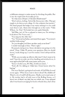
I've been preparing Remix for publication as a paperback (with my own micro-press, Hoxton Press) and thought others might be interested in some typography tips I've learned.
I believe the way a book looks matters enormously, and there is more to consider than you'd think. I'm lucky because I enjoy formatting, and have an obsessive and nitpicky nature that enables me to carry on tweaking until, as far as I can see, there's no more to be done.
I'm not going to discuss page numbering, headers and section breaks, though I know a lot of self-publishers have problems with them; I'll cover them in another post if there's any interest in this one.
- Choose your font carefully; don't just go with Times New Roman. For instance, Minion, Bembo, or Warnock Pro are all recommended by Penguin typographers. I settled on Adobe Caslon, which comes in many weights and has a capital Q to die for. Consider using a different font for chapter headings, numbering and headers.
- Don't be put off because the font you want is expensive. You can often find free font downloads on the internet. This is a good site here.
- If preparing your text in Word rather than a specialist program like InDesign, go to Tools, Options, Compatibility, and tick Do full justification like WordPerfect 6.x for Windows. This has a magical effect on the spacing; the text immediately looks better.
- Adjust the space between the lines till it looks right. Go to Format, Paragraph, line spacing, and choose Exactly from the drop down menu. Select a number of points 3 - 4 greater than the font size. For instance, if you are using 11 point font, try 15 point spacing. Experiment and see which looks best printed out; compare with published books.
- Aim for around 66 characters on a line, which is said to be the easiest to read. Indents should be no more than three characters.
- Go to Format, Paragraph, Line and page breaks and turn off Widow and Orphan control. If you leave it on, many of your pages will be shorter, looking messy. (But you will then have to check manually to avoid pages with just one line or word on them.)
- Hunt for crowded lines of text, or lines with too large gaps between words, and improve them with an optional hyphen where you can. (Press Ctrl and -.) An optional hyphen will disappear if you make changes and the text flows so it is no longer needed.
- Read the whole text, checking for spacing, particularly around italics. You will often find putting in a judicious extra space makes all the difference.
- Print it out, and check it again. Make changes, print it a second time and check.
- You're done.


Well all I can say is I can't wait to have your book in print in my hands!!!
ReplyDeleteGood luck!!
take care
x
With all its hand-crafted spaces and elegant Qs...thanks, Kitty.
ReplyDeleteI just hope I don't find anything amiss in the finished book - I'd be mortified.
thanks for posting. i'll have to deal with this again in a few months and have forgotten a lot of it since self-publishing my fantasy novel in 2007.
ReplyDeleteMichelle, yes, it's the sort of information you get immersed in while you're doing it, but it doesn't necessarily stick. I thought I'd better write the post while it was fresh in my mind.
ReplyDeleteGood luck with your next book.
So the question now is, how much do you charge for fine tuning manuscripts?
ReplyDeleteDepends what state the manuscript is in, and how much the market will bear :o)
ReplyDeleteAh, well in that case I can't afford it. Darn it all.
ReplyDeleteCongrats, I just saw that Remix is solidly in the five digit Amazon ranking territory. But that's in the US, where are all the readers who can actually understand all of your Gherkin references?
Ooh, that sounds good about Amazon ranking. What does it mean?
ReplyDeleteAlan, after all the editing you did for me with Tor and Trav I am in your debt big time. If you ever want me to do any nitpicky formatting for you, you have only to say.
Are you sure that font site is on the up and up? They do have a lot of stuff, but some of it generally isn't free.
ReplyDeleteHi Cryselle! I linked to that site four years ago because I'd downloaded fonts from there. The fact that it's still operating, and has a Norton Safe Web link suggests it's okay. The site offers free downloads of Adobe Caslon in all its variants.
ReplyDelete